
How to take Amazon A+ Content beyond plain text and build a book page readers remember
In an earlier post I explained what Amazon A+ Content is and why your listing needs it. Today I want to go further, into what separates A+ Content that simply exists from A+ Content that actually sells. Because adding it is only the first step. Designing it well is where the real difference happens.
From Information to Experience
Plain A+ Content delivers facts. It restates the description, lists some details, and stops there. It is better than nothing, but it does not move anyone. A+ Content that sells does something else entirely. It creates an experience. It makes a reader feel the mood of your book before they have read a single page.
For a thriller like Blackwater Parish, that means a listing that feels atmospheric and tense, with imagery that carries the weight of bayou heat and buried secrets. The reader should sense the book in their body, not just understand it in their head.
What Strong A+ Content Includes
The most effective A+ Content tends to combine a few elements. A striking visual banner that sets the tone immediately. A clear statement of what the book is and who it is for. Imagery that reflects the genre and emotional register. And, when relevant, a section that introduces you as the author so readers connect with a real person.
None of this is decoration for its own sake. Each piece is there to build trust and reduce hesitation. A page that looks considered signals a book that is worth your time.
The Trust Factor
Readers make fast judgments about quality, often unconsciously. A bare listing can make even an excellent book feel uncertain. A polished, visual listing signals professionalism and care. That signal matters enormously for independent authors, who do not have a major publisher’s name doing that reassurance work for them.
This is not about tricking anyone. It is about making sure your presentation matches the quality of what is inside. When the two are aligned, readers relax and trust their curiosity. When they clash, even a strong book can lose a reader before page one.
Where the Visuals Come In
The visual side of A+ Content is where many authors get stuck, and understandably so. Most of us are writers, not designers. We can picture the mood we want but have no way to produce it. The result is often a listing that under sells a wonderful book.
This is exactly the gap Author Visibility Studio was built to close. We create cinematic graphics that capture the feeling of a book and translate it into images that belong on a professional listing. The mood you imagined finally appears on the page.
Consistency Across the Page
Strong A+ Content also feels unified. The fonts, colors, and imagery should speak the same visual language from top to bottom. A page that shifts styles partway through feels unsettled, even if the reader cannot say why. Consistency quietly communicates that everything here was intentional.
That cohesion is something we pay close attention to in the Studio. A reader should move down your listing feeling that every piece belongs to the same world, the world of your book.
Design for the Phone First
A large share of readers browse on their phones, which changes how A+ Content should be built. Text that looks fine on a wide screen can become cramped and unreadable on a small one. Images that are busy lose their impact at phone size. Designing for the phone first, then letting it scale up, keeps your listing strong everywhere a reader might see it.
This is an easy detail to overlook and a costly one to ignore. If your most beautiful module only works on a desktop, most of your readers never experience it the way you intended.
How Author Visibility Studio Builds It
When we develop A+ Content, we start from the emotional core of the book. What should a reader feel within the first few seconds? From there we design visuals, structure the sections, and shape the copy so the whole page works toward that feeling. We keep it consistent from top to bottom and make sure it holds up on a phone as well as a screen. The goal is a listing that does not just inform a browser but pulls them in.
Worth the Effort
A+ Content is one of the few places where an independent author can stand shoulder to shoulder with traditionally published books. The tools are available to everyone. What varies is how well they are used. Treating your listing as an experience rather than a formality is one of the most practical things you can do to help the right readers say yes.
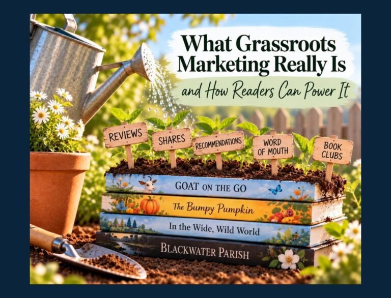 What Grassroots Marketing Really Is, and How Readers Can Power It
 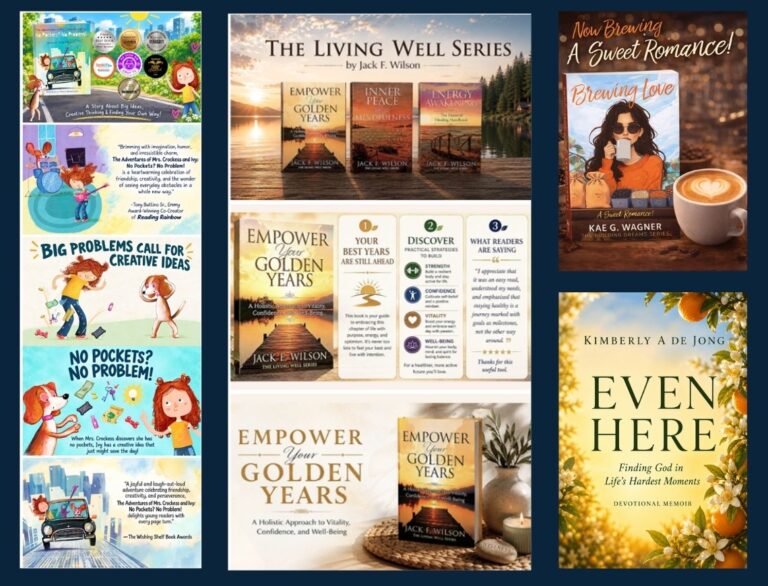 Bringing Other Authors’ Books to Life in Graphics